Design Principles Every Designer Must Know
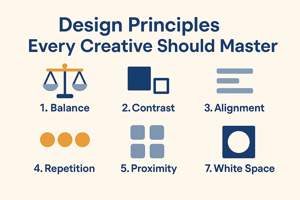
Design Principles Every Creative Should Master
In today’s fast-paced digital world, great design is more than just pretty visuals — it’s about solving problems, telling stories, and creating meaningful user experiences. Whether you’re a graphic designer, web developer, or branding enthusiast, understanding core design principles is essential to creating work that stands out.
At Logoxel, we believe that strong design begins with strong foundations. Here are the seven design principles every creative professional should master:
1. Balance
Balance ensures that your design feels visually stable and harmonious. There are two main types:
-
Symmetrical Balance: Elements are evenly distributed on either side of a central axis, giving a clean and formal look.
-
Asymmetrical Balance: Different elements are arranged in a way that still feels balanced but with more energy and movement.
✅ Pro Tip: Use asymmetry to add creativity, but make sure one side never feels too heavy or distracting.
2. Contrast
Contrast is what makes your design pop. It helps important elements stand out and guides the viewer’s eye naturally. You can create contrast through:
-
Color (dark vs. light)
-
Size (large vs. small)
-
Shape (geometric vs. organic)
-
Typography (bold vs. light)
✅ Pro Tip: Ensure enough color contrast for accessibility and readability, especially for text-heavy designs.
3. Alignment
Alignment brings order and clarity to your layout. It creates a visual connection between elements and prevents your design from looking random.
✅ Pro Tip: Work with a grid system — it’s the secret weapon of every professional designer.
4. Repetition
Repetition ties your design together and creates visual consistency. This can be repeating colors, fonts, icons, or shapes.
✅ Pro Tip: Use repetition strategically to strengthen brand recognition and create a polished, cohesive look.
5. Proximity
Grouping related elements together helps users quickly see the relationships between them. It improves readability and helps create hierarchy.
✅ Pro Tip: Avoid leaving too much space between related items — use proximity to guide users through your design logically.
6. Hierarchy
Visual hierarchy is how you guide the viewer’s attention. It ensures that they notice the most important information first.
✅ Pro Tip: Use size, color, and placement to highlight key elements like headlines, buttons, and calls to action.
7. White Space (Negative Space)
White space isn’t just empty space — it’s a design element that provides breathing room, improves focus, and creates elegance.
✅ Pro Tip: Don’t overcrowd your design. Simplicity often leads to more impactful results.
Why These Principles Matter
Great design doesn’t just happen — it’s intentional. By applying these principles, you’ll create designs that look professional, communicate effectively, and deliver a better user experience.
At Logoxel, we’re passionate about empowering designers, freelancers, and businesses with the right knowledge and tools. Whether you’re designing a logo, website, or ad campaign, start with these principles and watch your creativity shine.